Built to turn raw weather data into clean and animated graphics quickly. Read the case study to see how it all connects.
Built to turn raw weather data into clean and animated graphics quickly. Read the case study to see how it all connects.
Built to turn raw weather data into clean and animated graphics quickly. Read the case study to see how it all connects.
The Challenge
The Challenge
The Challenge
Animating weather data in After Effects is typically a time-consuming process. Creating graphs or dynamic visual elements from structured data like temperature, humidity, or time-based progression often requires either manual keyframing or custom expression setups. The technical foundation is handled once during toolkit development, but repeating that process for every new dataset or location would be inefficient for content teams.
This project was an experiment in solving that problem. Could we build a system that takes raw weather data in real time and transform it into polished animations using JavaScript and just one controller layer inside After Effects?
The goal was to remove repetitive formatting, eliminate the need for dozens of layers, and create a clean bridge between structured JSON data and design-driven motion graphics.
Exploring Javascript for Data
Exploring Javascript for Data
Exploring Javascript for Data
To begin automating the animation process, I wrote a JavaScript code that fetches real-time weather data from the OpenWeather API.
To begin automating the animation process, I wrote a JavaScript code that fetches real-time weather data from the OpenWeather API.
To begin automating the animation process, I wrote a JavaScript code that fetches real-time weather data from the OpenWeather API.
The user simply needs to update the city name in the code and run it through the terminal.
The user simply needs to update the city name in the code and run it through the terminal.
The user simply needs to update the city name in the code and run it through the terminal.
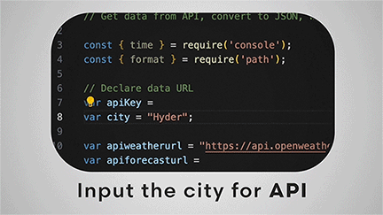

Once executed, the script generates two JSON files.
One contains metadata such as city name, sunrise and sunset times, visibility, temperature, and other key parameters.
Once executed, the script generates two JSON files.
One contains metadata such as city name, sunrise and sunset times, visibility, temperature, and other key parameters.
Once executed, the script generates two JSON files.
One contains metadata such as city name, sunrise and sunset times, visibility, temperature, and other key parameters.
The second includes three-hourly readings that track temperature progression and humidity throughout the day for a few days.
The second includes three-hourly readings that track temperature progression and humidity throughout the day for a few days.
The second includes three-hourly readings that track temperature progression and humidity throughout the day for a few days.

This structure allowed me to format the incoming data cleanly and control exactly how it would be interpreted inside After Effects. By pre-processing the data in this way, I could maintain full creative control over what gets visualized and how, without cluttering the AE file or relying on additional scripts during animation.
This structure allowed me to format the incoming data cleanly and control exactly how it would be interpreted inside After Effects. By pre-processing the data in this way, I could maintain full creative control over what gets visualized and how, without cluttering the AE file or relying on additional scripts during animation.
This structure allowed me to format the incoming data cleanly and control exactly how it would be interpreted inside After Effects. By pre-processing the data in this way, I could maintain full creative control over what gets visualized and how, without cluttering the AE file or relying on additional scripts during animation.
Workflow
Workflow
Workflow
Once the data is generated, the user simply opens the After Effects project and selects the measurement units and time format (12-hour or 24-hour). The entire animation is controlled through a single controller layer, eliminating the need for multiple compositions or manual keyframing.
Once the data is generated, the user simply opens the After Effects project and selects the measurement units and time format (12-hour or 24-hour). The entire animation is controlled through a single controller layer, eliminating the need for multiple compositions or manual keyframing.
Once the data is generated, the user simply opens the After Effects project and selects the measurement units and time format (12-hour or 24-hour). The entire animation is controlled through a single controller layer, eliminating the need for multiple compositions or manual keyframing.

The visuals were designed to emphasize clarity, legibility, and balance. Temperature progression is represented as a smooth animated plot.
The visuals were designed to emphasize clarity, legibility, and balance. Temperature progression is represented as a smooth animated plot.
The visuals were designed to emphasize clarity, legibility, and balance. Temperature progression is represented as a smooth animated plot.
A clean, monochromatic background supports a color-coded system, where seven distinct colors represent the seven weather categories defined by OpenWeather
A clean, monochromatic background supports a color-coded system, where seven distinct colors represent the seven weather categories defined by OpenWeather
A clean, monochromatic background supports a color-coded system, where seven distinct colors represent the seven weather categories defined by OpenWeather

Icons, text, and accent elements like rectangles are kept minimal and responsive, ensuring the data remains the visual focus
This setup ensures that no matter which city is chosen, the animation remains visually cohesive and consistent, while still dynamically adapting to each dataset.
Icons, text, and accent elements like rectangles are kept minimal and responsive, ensuring the data remains the visual focus
This setup ensures that no matter which city is chosen, the animation remains visually cohesive and consistent, while still dynamically adapting to each dataset.
Icons, text, and accent elements like rectangles are kept minimal and responsive, ensuring the data remains the visual focus
This setup ensures that no matter which city is chosen, the animation remains visually cohesive and consistent, while still dynamically adapting to each dataset.
Toolkit in Use
Toolkit in Use
Toolkit in Use
Here’s a look at how the system translates real-time weather data into animated graphics.
Here’s a look at how the system translates real-time weather data into animated graphics.
Here’s a look at how the system translates real-time weather data into animated graphics.

All visuals are automatically generated from JSON inputs using a single controller layer in After Effects.
In this example, the city-specific weather conditions influence the temperature plot, humidity bars, icon states, and color themes. No manual editing is required once the code is run.
All visuals are automatically generated from JSON inputs using a single controller layer in After Effects.
In this example, the city-specific weather conditions influence the temperature plot, humidity bars, icon states, and color themes. No manual editing is required once the code is run.
All visuals are automatically generated from JSON inputs using a single controller layer in After Effects.
In this example, the city-specific weather conditions influence the temperature plot, humidity bars, icon states, and color themes. No manual editing is required once the code is run.
This kind of automation becomes especially powerful when working with large datasets that need to be standardized and visualized often. It could be applied to use cases like environmental reporting, educational content, or data-driven social media graphics.
This kind of automation becomes especially powerful when working with large datasets that need to be standardized and visualized often. It could be applied to use cases like environmental reporting, educational content, or data-driven social media graphics.
This kind of automation becomes especially powerful when working with large datasets that need to be standardized and visualized often. It could be applied to use cases like environmental reporting, educational content, or data-driven social media graphics.
What's Next!
What's Next!
What's Next!
This toolkit was built as a technical experiment, but it opens up interesting possibilities for automation in motion design.
If developed further, it could include a ScriptUI panel to input the city name and fetch data directly, removing the need to use the terminal. A render system could also be introduced to queue and export multiple cities automatically.
Additional enhancements might involve exploring alternate themes, or designing a lightweight user interface for previewing data before animation begins. These improvements would bring the system closer to being a fully reusable tool for larger teams or studios working with real-time or frequently updated data.
If you’re looking to scale your content production without compromising quality, this toolkit approach can be tailored to your needs. Feel free to reach out at hey@kruthihv.com. I’d love to hear what you’re working on.
Credits
Credits
Credits
Design, Animation, Toolkit Design & Development by Kruthi Hindupur Vasanthamadhava
Design, Animation, Toolkit Design & Development by Kruthi Hindupur Vasanthamadhava
Design, Animation, Toolkit Design & Development by Kruthi Hindupur Vasanthamadhava